Creative studio
Vienna, AT
Summer 2025
Mon-Fri 10am-6pm

Enso
-
Services
Strategy & Storytelling
Branding & Visual Identity
Creative visual direction
Print
Industry
Well-beingClient
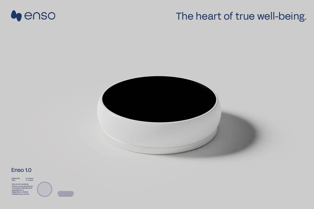
Enso-heart
Welcome to a new era of well-being with an innovative pocket therapist. Two Slovenian psychotherapists working with heart coherence therapy set out to develop Enso - an innovative device that helps you positively affect your cognitive functions, emotions and overall well-being. We worked as collaborative partner and joined their development journey in early stages to form their idea into full brand identity.


PROJECT CHALLENGE
Enso fuses technology with personal growth, shaping a unique and inviting experience. More than just a meditation tool, it's like carrying a pocket therapist, guiding you back to your true self. By tuning into your heartbeat while experiencing guided meditations, you enter a space of deep receptivity—where inner alignment meets clarity. In this state, the therapeutic guidance becomes far more impactful, connecting deeply with both mind and body. The result? A profound sense of calm, balance and clarity that carries into your everyday life—leaving you more relaxed, centered, and deeply focused.
OUR APPROACH
Clean, refined forms give Enso its technological essence, while the serene colour palette—a calming mix of primary blues and near-whites, with soft touches of purples, blues and greens brings balance. Circles and fluid lines guide the brand’s visual identity, complemented by bright, minimalistic photography that evokes four distinct moods: morning balance, mid-day focus, afternoon relaxation and evening calm. Each scene is shaped by warm morning light, crisp afternoon tones, or soft evening hues. Enso is always seen in action or part of a tranquil setting, accompanied by headphones, subtly showing how it seamlessly integrates into daily life.


BALANCE YOU CAN FEEL
We were inspired by the calming patterns found in nature — those repeating shapes and soft circles that feel natural. Sacred geometry served as a base to show calmness and connection visually, while steady rhythm of heart coherence dictated the continuous flow of shapes, icons and colour tones. We brought those ideas together to design a brand that feels grounded, balanced and soothing like a calming moment you can carry in your pocket.
SACRED GEOMETRY & HEART COHERENCE
Drawing from nature’s inherent patterns, sacred geometry provides a visual language that connects the circles and grids to deeper, spiritual meanings. By bringing together the steady rhythm of heart coherence with the smooth, continuous flow of a circle we create a sense of balance and calm.
Sacred Geometry shapes
Heart coherence graph
Sound and rhythm visualisation