Creative studio
Vienna, AT
Winter 2026
Mon-Fri 10am-6pm
Crema Café
-
SERVICES
Strategy & Storytelling
Branding & Visual Identity
Creative visual direction
Print
Website
Brand Campaign
INDUSTRY
Food and beverage
Crema Café is a vibrant coffee haven nestled in the heart of Vienna, where contemporary design meets the art of social interaction. With seasonal coffee blends and freshly baked pastries wafting through the air, every visit becomes a sensory journey filled with delightful flavours and uplifting vibes. The café's flexible, open space invites you to connect with friends, unwind with a book, or find your creative flow while working. It’s a great spot to kick back, catch up with friends or simply enjoy a moment to yourself.


PROJECT CHALLENGE
In hospitality, especially in a café, the baristas' attitude and vibe shape the guest’s entire experience. Before the coffee is even served, that initial human connection sets the tone. At Crema Café, we aimed to bridge the gap between the baristas' personalities and the energy of the space. The café is driven by its two owners—complete opposites, inspiring each other daily—and this dynamic inspired the pairing of two distinct typefaces, working in harmony. The language of the brand is bold, energetic, and unapologetic, while the illustrations reflect the café’s diverse offerings.
OUR APPROACH
Crema Café is a bold yet inviting spot, calling coffee enthusiasts from Vienna’s busy streets to gather and connect over a perfect brew. Its visual identity is a conversation between two colors, offering a playful space for interpretation. We imagined a creative direction that merges strong, expressive statements with the artistry of coffee making, using bright, warm imagery to create a moment that makes passersby stop and wonder about this intriguing coffee spot.


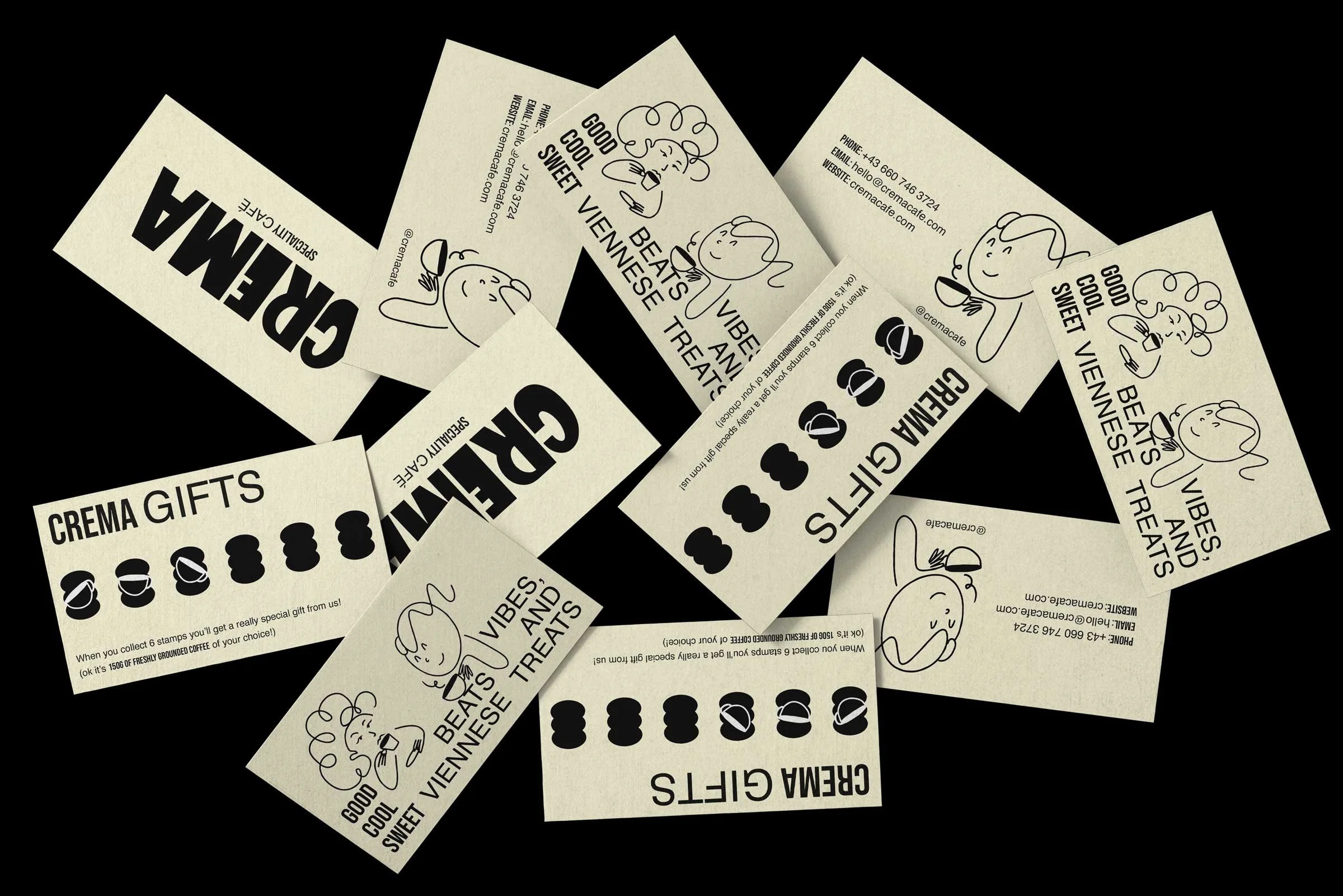


CLEAN, BOLD & A LITTLE PLAYFUL
We took inspiration from the Bauhaus and Mid-Century Modern design movements - two styles that made everyday things feel like little pieces of art. Bauhaus gave us a love for simplicity and function, while Mid-Century brought in some fun with quirky illustrations and bold, cut-and-paste visuals. We blended those ideas to shape Crema’s identity with clean layouts, standout type and packaging that feels both clear and creative, just like the coffee they serve.
THE BAUHAUS & MID-CENTURY MODERN DESIGN MOVEMENT
Bauhaus transformed design by prioritising simplicity and functionality, merging art with technology. This was expressed through bold typography that delivered clear visual communication in posters and ads. The Mid-Century Modern movement followed suit, adding a playful flair with whimsical illustrations in packaging and marketing materials. This cut-and-paste style turned everyday items into mini art pieces, deeply influencing Crema’s brand identity and packaging design with its focus on clarity and creativity.
Bauhaus magazine, Herbert Bayer, MoMa 1927
Clip Books of Line Art, Harry Volk Jr. Art Studio, 1969
Mid-Century Modern Graphic Design, Theo Inglis


